Wodify
We're presenting an intuitive and lean design framework for a fitness application.
What is Wodify?
Wodify is an all-in-one fitness app that allows you to make your workout more effective, manage your activities and plans in one place, and build a community in one gym. Our task has been to redesign Wodify's framework and create a new, more user-friendly digital experience.
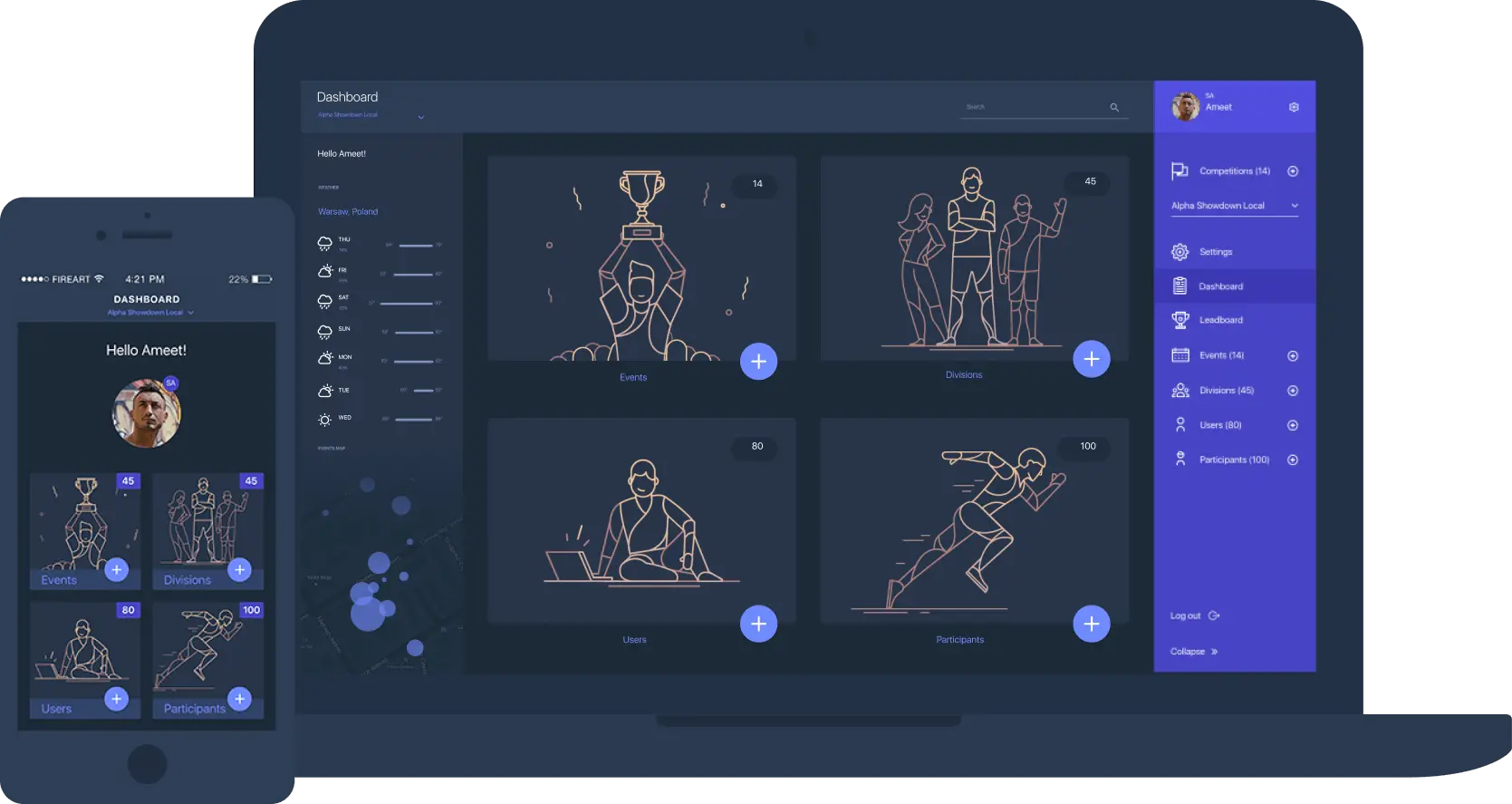
The concept
Usually, you have to scroll many apps before you find the one that will help you create a perfect workout plan. The main concept of Wodify is to combine all of them into one comprehensive user interface.
Cleaner layout
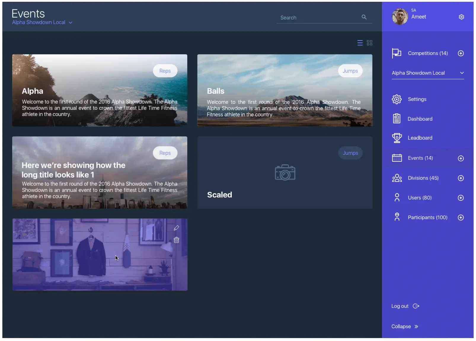
We have broken all the content down into cards to make information more scannable and easier to digest. The old design has lacked whitespace and clean typography. Hence, we have applied a better-structured hierarchy in a new UI framework.
Layers
Proper presentation
A workout plan for a day includes a very neatly created calendar located in the header. All the information is categorized and properly organized to avoid cognitive overload.
Layers
Integrated timer
One of the most significant changes has been adding a timer that matches different workouts. It helps a user save time and manage everything more effectively.
Layers
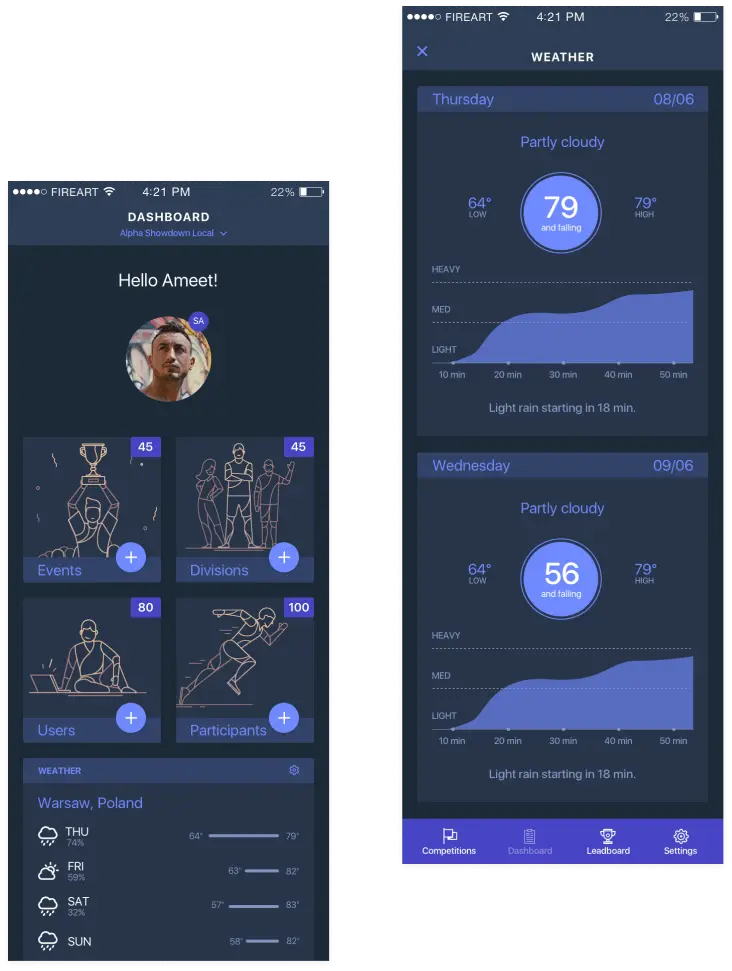
Sizing is critical
We have adjusted sizing during the redesign process. Now, you don't need to pause a workout to check the time and other important information. We have enlarged fonts in a user interface to make it visible to a user at a glance.
Layers
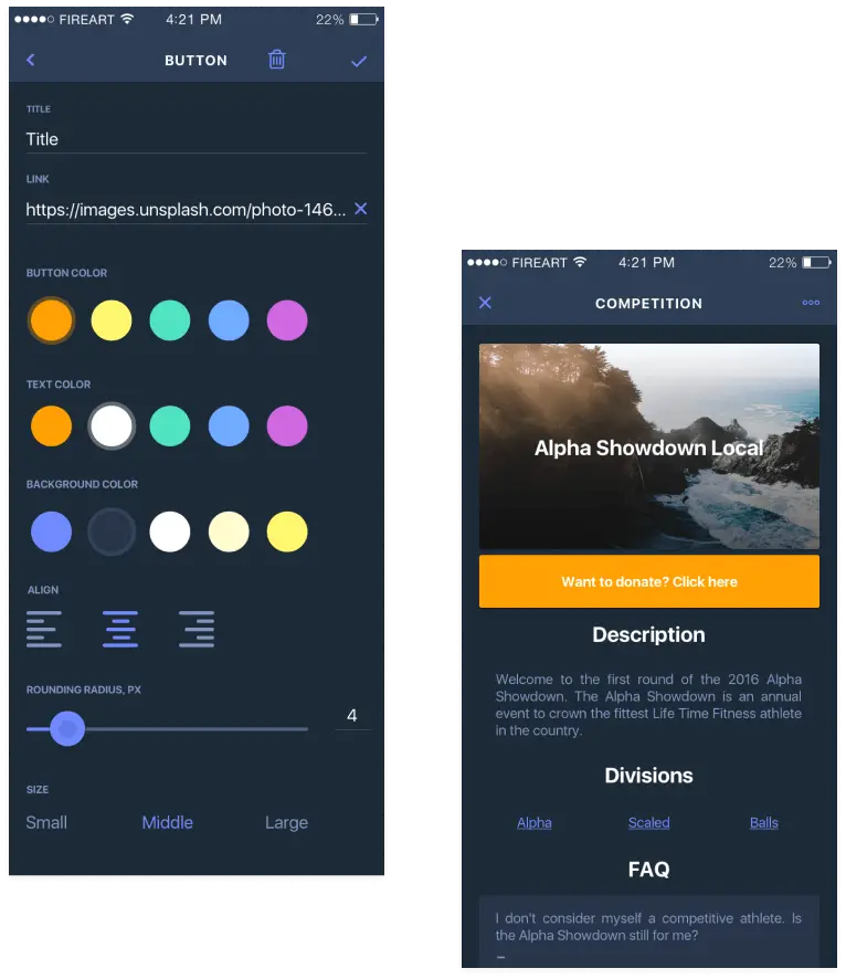
Proper display of important information
When working out, users need to have quick and direct access to relevant information. The last thing users want is to jump through screens to find their metrics. We have improved the overall user experience by displaying total times, slowest rounds, and adding the ability to take notes.
Layers
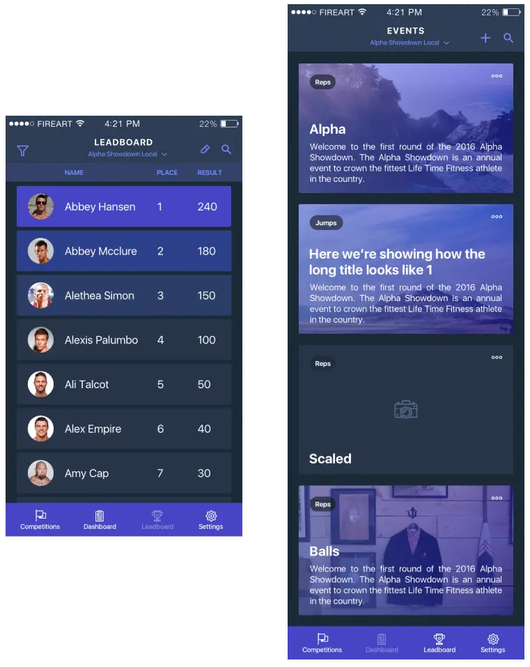
Making it easier
Now, to log workouts is much easier than before. We know users are tired after exercises, so we have added a screen that allows you to do it more quickly, without having to go through a lot of unnecessary steps.
Layers
Convenient additions
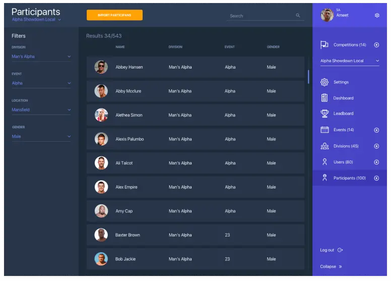
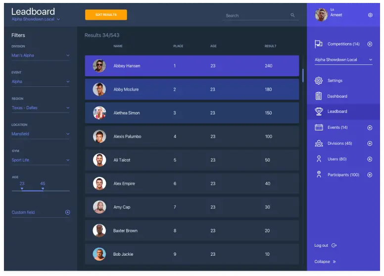
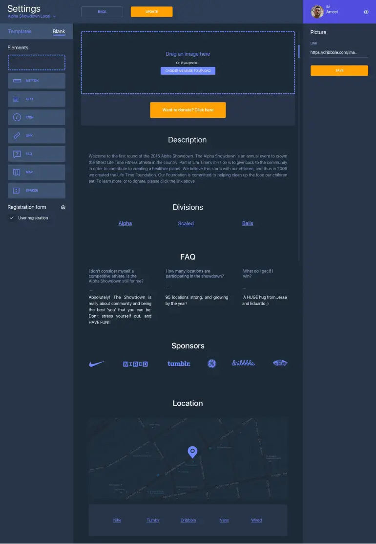
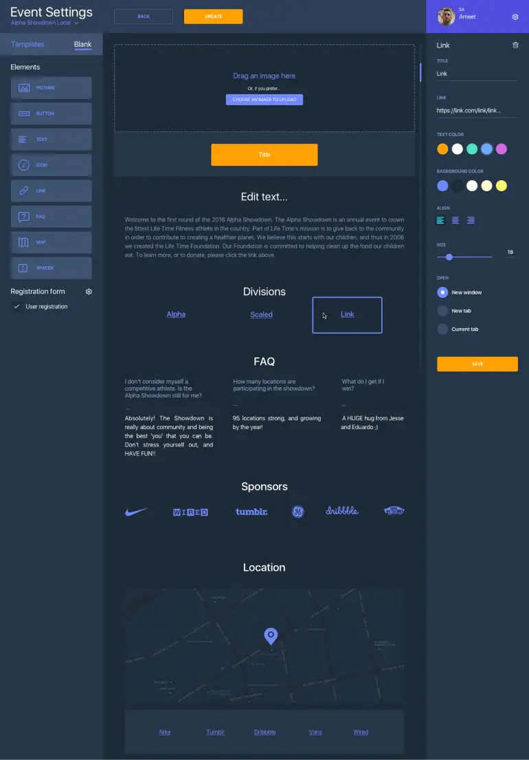
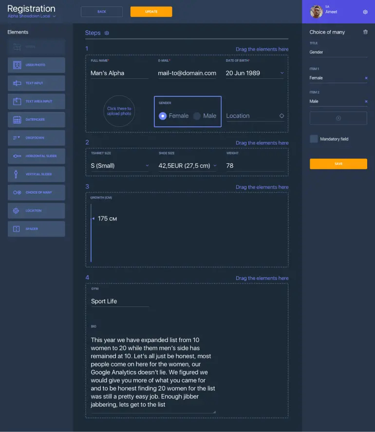
We have also adjusted a Dashboard to let users more easily access all the key information about participants, divisions, events, and more.
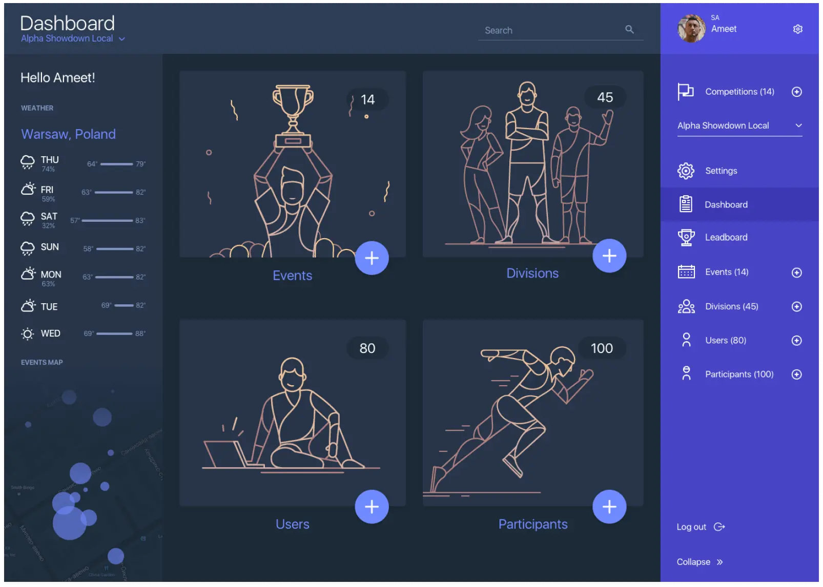
Now, everything is well-organized in an elegant user interface. The dark blue palette adds even more style to an app and doesn't distract a user from its essence.
